Sunday, September 27, 2009

Working Subtractively

It's been a few days since I posted anything, so I'll try to do a little recap. On Tuesday, we had a pin-up, reviewing our site analyses. Between Tuesday and Thursday, Lisa and I produced about 50 section cuts through our sites shadows and put together some digital building designs based on our sections and plans through the site. On Thursday, Lisa and I had a desk crit with Karl and went over our sections, which led into a discussion about our building designs. Again, Karl reminded us that the way you work and produce drawings influences the way you think about the site and approach building design. For example, we talked about the Federal Environmental Agency building by Sauerbruch and Hutton in Dessau, Germany, and the Double House by MVRDV.


(North/South Sections)


(East/West Sections)

We also talked about natural terraces and the forms which they take. Lisa and I began thinking of our site as contoured topography with highs and lows, steady and dramatic stepping, and variances in heights and widths depending on sun exposure. We talked about how we wanted to create permeations in our building in order to let light sink into otherwise dark spots within the program. I did a model in Digital Project; I experimented with a new method of working. I worked subtractively, starting with solid floor plates and subtracting voids. We contemplated the pros and cons of using many small permeations versus a couple larger ones. What would create the most light yet support a reasonable programmatic assembly?

(http://www.goway.com/asia/philippines/phil_img/banaue_rice_terraces450.jpg)


(Screen shot of my DP model)


Lisa and I set up some rules of thumb and then each built several massing models at 1/64" scale. Our rules were based off of sun exposure on the site. The southwest corner would be the lowest point of the building, and the northeast corner would be the highest. The reasoning behind this stems from the ample southern exposure, and the extreme shadows cast on the northeast portion of our site due to the neighboring high rise building in the east. We knew that we wanted the gym in the northwest corner of the site and the auditorium on the west portion of the site, since neither program needs too much natural light and would therefore work well in solid areas of the site.

Today Lisa and I went through all of our mini models and discussed what did and did not work about them. We made more conclusions and rules about the placement of the exterior courtyards and interior atriums based on the amount and angles of sunlight. We discussed which degrees of stepping/terracing worked best and found that the southern portion of the building works best with gradual terracing, blending with the site/ground/surrounding terrain. We decided where to place the entrances, administrative areas, library, etc.

After making these decisions, we set up a template file in Digital Project and started thinking about the possibility of setting up some parameters. We tried to set up a parameter which would control the areas of certain spaces, keeping the area constant, while allowing us to change the length and width of those spaces. We could not figure out how to put the parameter into effect. We also discussed the possibility of using parameters to determine the size of common spaces and courtyards.

We're both going to work on designs based on our template, rules, and general conceptions. Tomorrow we will compare and combine again. We've found that setting up rules, then using them to each come up with options, discussing our variations, and combining the best qualities of all the models, works well for us. It sets up an interesting conversation, allows us to bounce ideas off each other, and refine our designs. Edit, edit, edit.

Sunday, September 20, 2009

Digital Site Analysis

Lisa and I spent the majority of the weekend messing around with our Digital Site Analysis. It seems that the software had trouble reading the shadows as solids once more buildings were including in the analysis. Both of us spent hours upon hours redoing things and trying out other methods. Eventually, we just decided to scrap the solids and make the shadows surfaces. We figured that if anyone discovered the miracle cure, that we could transform our surfaces into solids later on.

Once we were done constructing the shadows, we put together a revised sun chart with our Photoshopped screen shots. We chose to focus on June 21 and Dec 21, between 8am and 4pm (approximate school hours). By using the two solstices, or extremes, you can imagine the shadows which occur during the middle months. Doing this shadow analysis gave us an idea of the light conditions on our site throughout the whole year. We're going to have to figure out a way to get light into our school in the winter months when the shadows seem to take over the site.

(Our site analysis chart)


Friday, September 18, 2009

CTools Site

Yesterday Lisa and I set up a CTools site as a way of keeping track of our resources, sharing files, leaving messages or notes detailing the latest updates or ideas, and compiling a list of web links. So far, it seems like a good tool to aid our partnership and keep things rolling.

Thursday, September 17, 2009

Meeting with Lisa

Lisa and I met this morning to discuss the readings and come up with some references to take a look at.


NORTH BARRINGTON SCHOOL, BARRINGTON, IL
North Barrington School was my K-5 elementary school. I attended class in the old building K-4 until the new school was ready for my final year. The new school was divided up into 3 hexagonal shapes at one end, a rectangle and two mirrored triangles at the other end. The school is two levels and the hexagonal areas on each floor are called pods. Pods host classrooms and shared space for each grade level. For example the 1st grade pod has a gathering spaces, bathrooms, and then several separately enclosed classrooms. All grades share the non-hexogonal spaces including the rectangular area (gym, cafeteria, and courtyard) and triangular areas (art classroom, music classroom, nurses office, etc.). I just thought it was an interesting to divide up the grade-levels yet keep them interactive. Also as Lisa said, there are times you don't want the first-graders to have contact with the eigth-graders.


LIGHT-TUBES
I remember going to a lecture last year where a man talked about using "light tubes" to bring light into dark interior rooms. The tubes would reach from the roof and make their way into the rooms, providing "free" natural light.


GSW BUILDING, BERLIN, GERMANY
When I was in Berlin for my Studio Abroad, I had the chance to visit the GSW building. The building uses shading devices, which automatically close or open in response to the sun. However, there is also a way to manually shut the shading devices if needed (ex. office wants to give a presentation). The flexibility of these devices promises desired lighting conditions.

There was also a lower section of the building, which might fall in the shadows of the tower. This lower section uses skylights which are the length of the entire double-story hallway to bring in the diffused natural light. This area also uses mirrors to reflect what ever light does make it into the building. Again, just more things to think about when it comes to lighting devices or methods.


INSTITUTE DU MONDE ARABE, PARIS, FRANCE
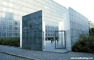
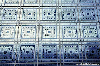
Lisa brought up Jean Nouvel's Institut du Monde Arabe in Paris, France. This building has a facade made up of diaphragms (like camera lens) which control the amount of sunlight which gets in the building. This represents another method of controlling the lighting conditions within a building.


Lisa and I also talked about the possibility of having numerous types of light or "filters" of light within our school. As Lisa mentioned, kids learn by playing and interacting with things; our building should play and interact with light.


Paul Lukez and Hugh Ferriss Readings

We were assigned two readings: Paul Lukez's "Kenmore Square: A Case Study" and Hugh Ferriss's "The Metropolis of Tomorrow."

Kenmore Square
I found this reading extremely helpful in thinking about to carve out a space. The students produced charcoal drawings based on a pedestrians visual experience of space and time. They began with a figure-ground study and overlayed it with charcoal dust. Then they mapped several perspectives of the square based on the direction of approach. The visual experiences were represented by gradations of charcoal; the whitest space represented the most visible space.

There were some important points that I got out of this reading. The project was all about the pedestrian's ever-changing perception and experience within a 4th dimension of time and space. Working through perspective, versus plan, puts us within the pedestrians vantage point and therefore simulates more than just geometrical relationships put forth in plan. It's important to work in plan, section, and perspective concurrently for this reason. "Drawings and graphic explorations should be used as a means to improve the design process and products we produce - hopefully enhancing our environment and enriching the public's experience of space" (83).


Metropolis of Tomorrow
I only had a chance to flip through the electronic copy of this book, however I ordered it from Amazon because I found Hugh Ferriss's drawings to be both provocative and intriguing. The drawings which stood out the most to me were those which included scale figures. The scale figures, or people, always seems to be lurking in the shadows of the buildings and have no gradation whatsoever. I may post some of the drawings which caught my attention.

Wednesday, September 16, 2009

Tutorial 3 - Beginner Solid Modeling

This tutorial demonstrated the basics of solid modeling in Digital Project. The following screen shot was taken near the end of my tutorial.


Monday, September 14, 2009

Tutorial 2 - From Flat to Form

This tutorial was designed to demonstrate how to transform 2D sketches into 3D forms and still control the forms through parameters. The following two screen shots are from my Tutorial 2 forms.


(Variation 1a)


(Variation 2a)


(Variation 3a - Front)


(Variation 3a - Back)


The following screen-shots are from my second attempt to apply what I learned in Tutorial 2 to my original plan from Tutorial 1. However, my plan from Tutorial 1 did not work as well with the directions given in Tutorial 2. I could not make too many arches without making it overly complicated. Therefore, I focused on playing around with my Variations 1a-3a (above) and did not proceed to extrude the circles through the loft.


(Variation 1b)


(Variation 2b)


(Variation 3b)

Tutorial 1 - From Cathedral to Terminal

This tutorial was designed as an intro to the "Sketch" mode of Digital Project. Here are the screen shots of three variations of my diagramatic plan in both "sketch" view and 3D mode.


(Variation 1 - Sketch view)


(Variation 1 - 3D mode)


(Variation 2 - Sketch view)


(Variation 2 - 3D mode)


(Variation 3 - Sketch view)


(Variation 3 - 3D mode)